Visual Intensity
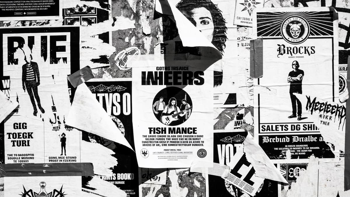
Hardcore punk strips everything to essentials—fast, aggressive music demanding equally direct visuals. The aesthetic favors impact over subtlety: bold graphics, confrontational imagery, typography that commands attention.
From Black Flag's iconic bars to Minor Threat's stark photography, hardcore visual language communicates with immediate force. The artwork should hit as hard as the music.
Hardcore artwork should feel like getting hit—immediate, intense, impossible to ignore.
Hardcore Punk — the genre's uncompromising visual tradition
Bold Visual Elements
Hardcore graphics favor simplicity and impact. Single-color prints, stark black and white, limited palettes that read clearly and cheaply reproduce. The aesthetic emerged from necessity and became signature.
Typography is direct and readable. Unlike metal's illegibility or emo's delicacy, hardcore text communicates clearly. The message matters; obscuring it defeats purpose.
Imagery often depicts confrontation—live performances, political statements, aggressive symbolism. The visuals should feel as oppositional as the music.
Minor Threat's Complete Discography — hardcore visual directness
Creating Hardcore Covers
Prioritize impact. Whatever concept you develop, execute with maximum directness. Hardcore doesn't do subtle; neither should its visuals.
Simple execution often works best. The genre emerged from limited means; elaborate production can feel wrong. Clean, bold graphics beat complex compositions.
Consider reproduction. Hardcore artwork often appears on patches, shirts, and flyers. Design that works in black and white, at small sizes, cheaply reproduced serves the community.
ReleasKit can generate bold, direct concepts—describe the confrontational energy you want.
Hardcore artwork should feel urgent—direct, aggressive, no time for decoration.
FAQ