DIY as Aesthetic
Punk emerged as rejection—of polish, of professionalism, of the gap between performers and audience. "Anyone can do this" wasn't just ideology; it was instruction. That DIY ethos extends to visual art: the hand-drawn flyer, the xeroxed zine, the deliberately rough aesthetic that signals authenticity and accessibility.
What started as necessity—bands without budgets making what they could—became deliberate choice. The punk aesthetic communicates values. It says: we're not trying to look like a major label act. We're not pretending we're something we're not. The roughness is honest.
Punk artwork should look like someone made it with intention and energy, not money and focus groups.
Punk Essentials — decades of punk artwork, from DIY zine aesthetic to modern hardcore
Zine and Collage Aesthetics
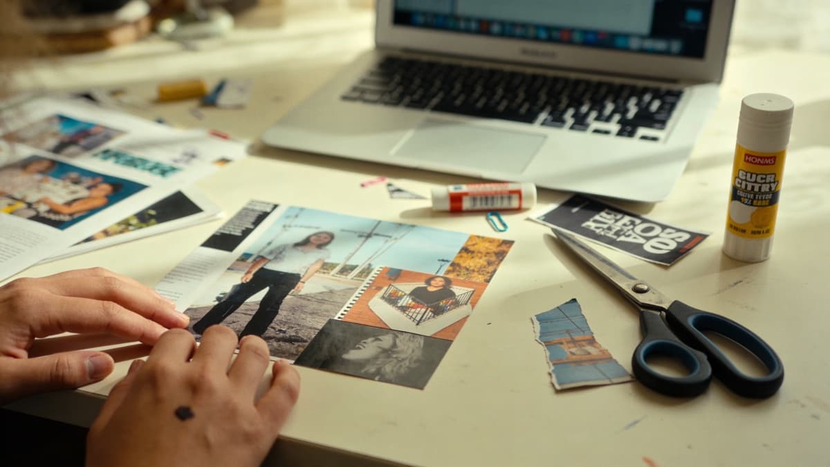
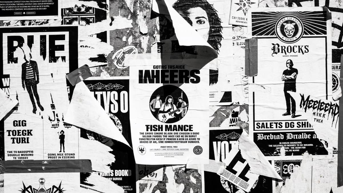
The zine tradition gave punk its visual vocabulary. Photocopied imagery, cut-and-paste collage, hand-drawn elements, ransom-note typography. Degraded by reproduction until only high-contrast shapes remain. This aesthetic carries punk's history in every xerox artifact.
Collage remains central to punk visuals. Combining disparate images creates tension and meaning—news photographs against cartoon imagery, text fragments forming new messages, found materials repurposed into statement. The seams show deliberately; the construction is visible.
Practically, you can achieve this digitally while maintaining authentic feel. Scan actual cut paper for texture. Use high-contrast adjustment to simulate xerox degradation. Layer elements with visible edges rather than seamless compositing. The digital tools execute analog aesthetics.
But actual analog process produces results digital simulation struggles to match. If possible, physically create collages and then photograph or scan them. The weight and shadow of real paper, the imprecision of actual cutting, the accidents of physical process—these carry authenticity digital assembly lacks.
Hardcore and Subgenre Variations
Classic hardcore: Bold, confrontational, often featuring strong graphic imagery. Band photographs in live performance intensity. Simple color schemes—often black and white with single accent color. Typography aggressive and readable; this isn't about mystery but impact.
Straight edge and youth crew: Clean imagery reflecting straight edge values. Bold X iconography. Positive imagery—unity, brotherhood, sports-influenced visuals. Strong graphic design with clear message.
Crust and d-beat: Maximum visual aggression matching sonic assault. Apocalyptic imagery, political statements, grotesque illustration. Often extremely DIY in execution. Barely legible band names, distressed textures, war and destruction motifs.
Post-hardcore and screamo: Often more visually experimental than hardcore proper. Emotional imagery, abstract elements, influences from poetry and visual art. Can range from minimal to dense, but typically with more artistic ambition than straight hardcore.
Pop-punk: Brighter, more accessible visuals reflecting musical accessibility. Cartoon imagery, humor, bold colors. The roughness is still there but friendlier—DIY with a smile rather than a snarl.
The Clash's London Calling — iconic typography and photography that defined punk's visual language
Alternative and Adjacent Aesthetics
Alternative rock's visual identity often sits between punk DIY and more polished indie aesthetics. The 90s alternative explosion produced distinct visual languages that continue influencing contemporary artwork.
Grunge: Washed-out colors, visible grain, thrift-store styling. Anti-glamour deliberately opposed to 80s rock excess. Photographs that look found rather than staged. Seattle weather as color palette—gray, muted, damp.
Shoegaze: Blur as technique. Soft focus, light leak, visual noise. Often nearly abstract—recognizable imagery dissolving into texture. Color washes, dream-like quality matching music's washed-out production.
Emo: Emotional intensity in visual form. Dramatic lighting, expressive photography, often black and white or high contrast. Text as emotional statement. The visual equivalent of lyrical vulnerability.
Contemporary indie-alternative: Often cleaner than historical punk aesthetics while maintaining DIY sensibility. Design-forward but not corporate. Thoughtful composition that doesn't feel focus-grouped.
My Chemical Romance's The Black Parade — theatrical imagery that pushed alternative rock visuals
Typography and Text
Punk typography breaks rules deliberately. Hand-drawn lettering signals human creation over machine production. Ransom-note assemblies from cut magazine letters carry aggressive energy. Stenciled text suggests street art and political action.
Readable versus illegible is a spectrum in punk. Pop-punk and melodic hardcore tend toward clear communication. Crust and grindcore embrace unreadability as aesthetic principle. Know where your music sits and what visual communication serves it.
For DIY typography, embrace imperfection. Handwrite with intention but not precision. Cut letters from printed material and scan the results. Use typewriter or dot-matrix fonts that carry analog associations. The text should look made, not set.
When using existing typefaces, consider degradation. Print, photocopy, scan, repeat. Each generation adds character. Or digitally add noise, displacement, and texture to clean type. The goal is suggesting physical process even when working digitally.
Photography in Punk Contexts
Punk photography prioritizes energy over technique. Live shots capture genuine intensity. Candid band photographs show real people rather than posed musicians. The rough edges are features, not bugs.
Flash photography—particularly on-camera flash—creates distinctive punk aesthetic. Harsh, flat, revealing. No flattering shadows or careful lighting. This is documentation, not glamorization.
Grain and contrast pushed to extremes transform photographs into graphic elements. High-contrast black and white reduces images to shapes and impact. This treatment connects contemporary work to zine traditions.
If shooting for punk artwork, consider cheap cameras as deliberate choice. Disposable cameras, phone cameras with poor low-light performance, vintage point-and-shoots—limitations become aesthetic. The resulting images carry authenticity expensive equipment sometimes obscures.
Creating Punk Artwork
The best approach is often actually making something. Physical collage, hand-drawn elements, photographed assemblies. The digital tools come after—for cleanup, reproduction, and distribution—but the core creation happens with hands and materials.
If working digitally throughout, study actual zines and physical punk art. Understand what makes the aesthetic work—the texture, the imprecision, the visible construction—and deliberately replicate those qualities rather than accidentally creating something too clean.
Consider political and social content. Punk has always been engaged with the world. Imagery that makes statements, references current events, or takes positions maintains tradition. This doesn't mean every cover needs explicit politics, but awareness of punk's engaged history informs authentic work.
ReleasKit can generate imagery with punk aesthetic when prompted appropriately: "Xerox collage texture, high contrast black and white, cut paper edges visible, zine aesthetic, raw and aggressive." The AI handles visual execution while you maintain conceptual direction.
Whatever your process, remember: polish is optional, energy is essential. The roughness isn't excuse for laziness—it's deliberate aesthetic choice that communicates values. Make it rough because you mean it, not because you don't care.
Punk artwork should look like it was made by someone who had to make it. Compulsion, not commission.
FAQ