Visual Vulnerability
Emo and screamo emerged from hardcore's intensity but centered emotional expression over political message. The visual aesthetic follows: personal imagery, vulnerable presentations, artwork that feels as emotionally exposed as the lyrics.
The genre has evolved through multiple eras—90s emo, mid-2000s pop-punk hybrids, emo revival—each with distinct visual conventions. But emotional authenticity remains central across iterations.
Emo artwork should feel emotionally exposed—as vulnerable as the most honest lyric.
Pop Punk Powerhouses — emo and pop-punk's visual range
Expressing Emotion Visually
Emo artwork often centers emotional expression directly—portraits capturing feeling, imagery suggesting internal states, visual metaphors for emotional experience.
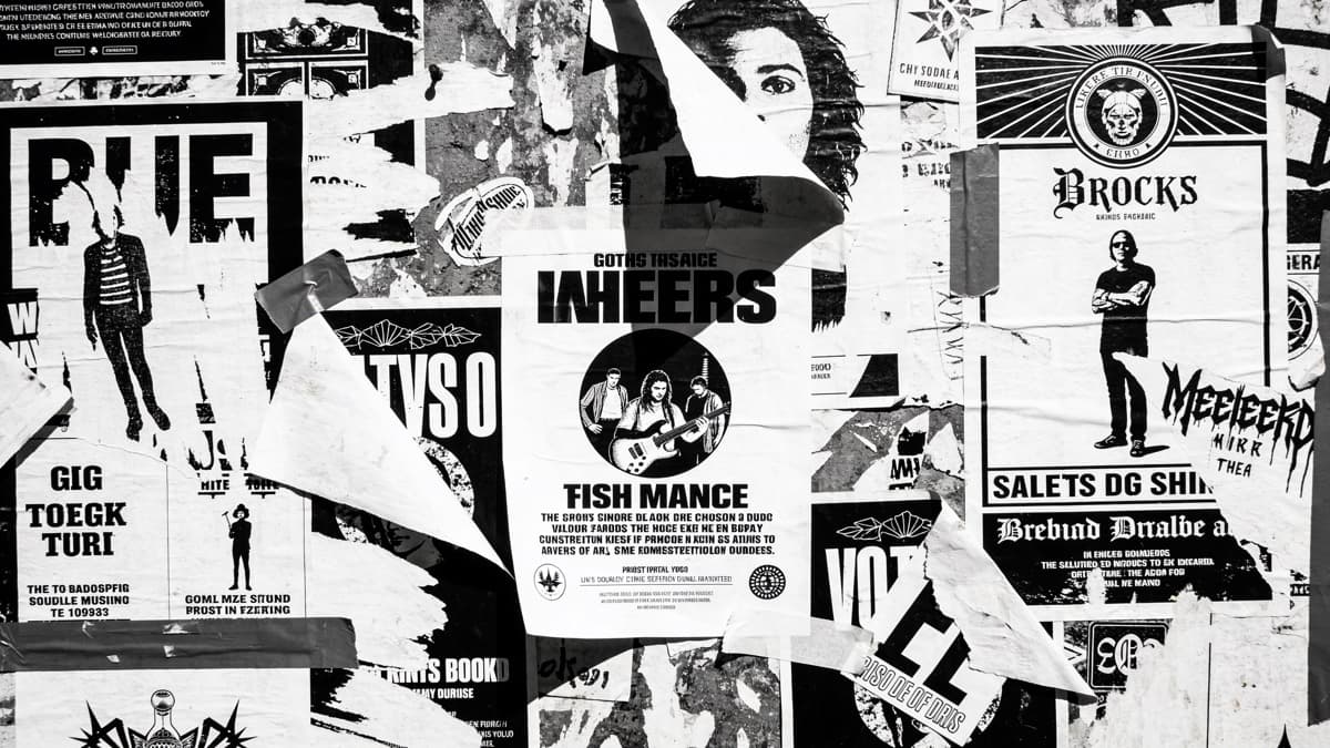
High contrast and dramatic lighting serve emotional intensity. Black and white appears frequently, stripping away distraction to focus on feeling. Color, when present, often communicates mood deliberately.
Personal imagery matters. The best emo artwork feels specific to the artist's experience, not generic "sad" imagery. Authenticity creates connection.
Brand New's The Devil and God Are Raging Inside Me — emo visual intensity
Creating Emo Covers
Start with genuine emotion. What feelings does the music express? Find visual language that communicates those specific emotions, not generic sadness or anger.
DIY aesthetic often serves emo. Hand-drawn elements, imperfect photography, visible creation process—these signals connect to punk heritage while communicating personal expression.
Consider era positioning. 90s emo, 2000s emo, emo revival each have distinct visual conventions. Know which tradition your music connects to.
ReleasKit can generate emotionally resonant concepts—describe the specific feelings you want to communicate.
Emo artwork should feel honest—emotionally raw, genuinely vulnerable, personally true.
FAQ