The Visual Language of Heavy
Metal has always been a visual culture. From the moment Black Sabbath put that ominous figure on their debut, heavy music has cultivated imagery as intense as its sound. Album art isn't just packaging—it's statement of intent, genre signifier, and cultural artifact.
The genre's visual traditions run deep, with distinct aesthetics for every subgenre. Thrash has different visual language than doom, which differs entirely from black metal. Understanding these conventions helps you create artwork that communicates accurately with listeners who've developed precise visual expectations over decades.
Metal album art should hit as hard as the first riff. No hesitation, no softness, no compromise.
Metal Essentials — Spotify's canonical metal playlist showcases decades of iconic artwork
Subgenre Visual Traditions
Classic Heavy Metal & Thrash: Bold, often colorful imagery with clear visual impact. Illustrated rather than photographic. Mascots, creatures, battle scenes, apocalyptic imagery. Clean linework, dynamic compositions, often painted in the style of fantasy illustration. Think Eddie, Vic Rattlehead, the Metallica aesthetic.
Death Metal: Grotesque, visceral, deliberately transgressive. Anatomical horror, decay, violence rendered in explicit detail. Color palettes often desaturated except for blood reds and sickly greens. The artwork should be as confrontational as the music. Technical execution matters—amateur gore reads as comedy rather than horror.
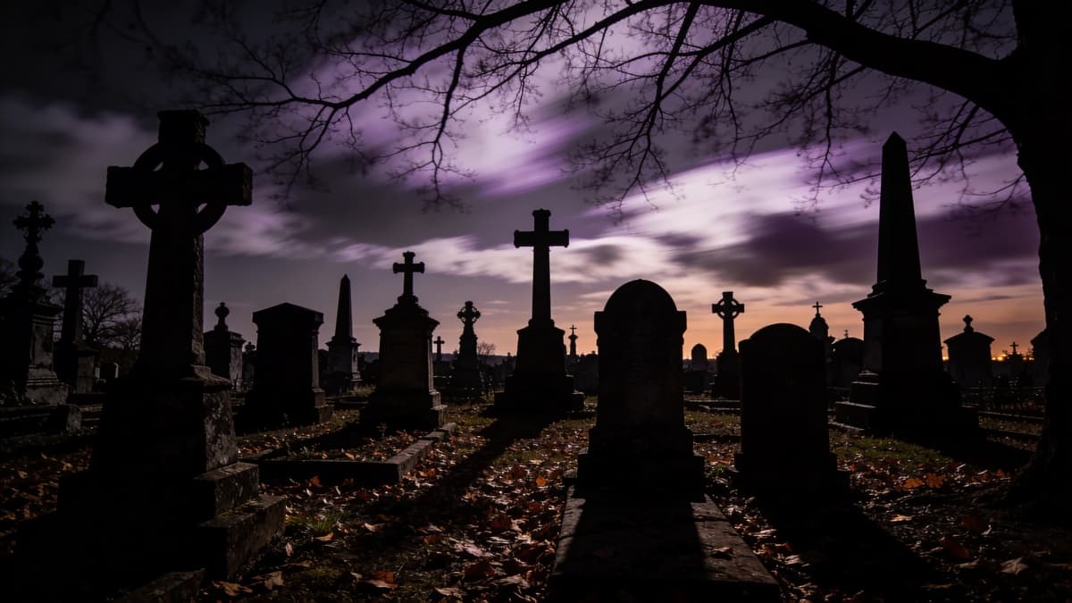
Black Metal: Atmospheric, often monochromatic. Forests, mountains, winter landscapes. Darkness as texture rather than just absence of light. Lo-fi aesthetics embrace—grainy, poorly reproduced imagery as deliberate choice. Corpse paint imagery, ancient iconography, medieval and occult references.
Doom & Stoner: Psychedelic influences meet heavy riffs. Rich, saturated colors—purples, oranges, cosmic imagery. Often highly illustrated with dense detail. Desert landscapes, occult symbolism, cosmic horror. Retro 70s aesthetics appear frequently.
Metalcore & Deathcore: Modern, often incorporating photography with heavy graphic treatment. Strong typography, sometimes approaching hardcore punk aesthetic. Can be both brutal and designed, with cleaner execution than traditional extreme metal.
Metallica's Master of Puppets — the crosses and headstones became instant metal iconography
The Role of Illustration
Illustration has been central to metal since the beginning. Painted covers carry different weight than photography—they exist in a realm of fantasy and extremity that photographs can't easily reach.
Traditional metal illustration requires significant technical skill. The best artists—Dan Seagrave, Kristian Wåhlin, Eliran Kantor—have developed distinctive styles over decades. If commissioning illustration, research artists whose existing work matches your vision. Expect to pay appropriately for quality work.
For independent artists, AI offers new possibilities. Models can generate detailed illustration in styles appropriate to metal—dark fantasy, cosmic horror, grotesque imagery—that would previously require commissioning traditional artists. The results require curation and often editing, but the baseline quality has become genuinely usable.
When using ReleasKit for metal artwork, lean into detailed descriptive language: "Epic dark fantasy illustration of ancient fortress under blood-red sky, armies of the dead rising, detailed linework, heavy metal album cover aesthetic." Style selection matters—illustrated or surreal modes often work better than photorealistic.
Metal Typography
Typography in metal is its own art form. Logos are sacred—fans recognize bands by the shape of their name before reading it. Creating distinctive metal typography is a specialized skill developed over the genre's history.
Classic metal logos tend toward elaborate but readable. Sharp edges, symmetry, medieval or gothic influences. They're designed to work on t-shirts and patches as much as album covers.
Extreme metal logos often push toward illegibility. Black metal logos especially become abstract tangles of lines that function more as sigils than text. This illegibility is intentional—it signals insider status, creates mystique, and separates the genre from mainstream accessibility.
If you don't have a distinctive logo yet, consider commissioning one. Custom metal logo designers exist specifically for this. A strong logo becomes part of your visual identity across every release. Don't rush this—it's a long-term investment.
For album titles and additional text, gothic and blackletter typefaces appear frequently, but so do custom hand-drawn lettering, distressed fonts, and runic or occult-inspired letterforms. Match the typography intensity to the music intensity.
Working with Dark Imagery
Metal artwork often depicts violence, death, occult themes, and other intense content. This comes with considerations both artistic and practical.
Artistically, the key is commitment. Half-hearted darkness reads as posturing. If your music is genuinely intense, your artwork should match that intensity without flinching. But intensity without craft is just shock value—execution quality separates effective extreme imagery from amateur attempts.
Practically, streaming platforms have content guidelines. Explicit gore, certain occult imagery, and other extreme content may be rejected or age-gated. This doesn't mean sanitizing your aesthetic—it means being strategic about what you show explicitly versus suggest. Atmosphere and implication often work harder than explicit depiction anyway.
Consider having alternative versions ready—one for vinyl and t-shirts where anything goes, one for digital distribution that meets platform guidelines while maintaining aesthetic impact. Many metal artists maintain this separation effectively.
Photography in Metal Contexts
While illustration dominates, photography has its place. Band photography—live shots, atmospheric portraits, performance imagery—connects the visual to real humans making extreme music.
Effective metal photography tends toward high contrast, dramatic lighting, and often monochrome or limited color treatment. The goal is making real people feel as larger-than-life as illustrated demons and warriors.
Location photography works well for atmospheric subgenres. Forests, ruins, industrial wastelands, remote landscapes—environments that carry emotional weight without requiring elaborate staging.
If using photographs, push them through processing that matches the intensity of illustrated work. Heavy contrast, grain, color grading, composite techniques. Raw documentary photography rarely matches metal's heightened reality—transformation is usually necessary.
Creating Metal Artwork
Know your subgenre and its visual traditions. Research extensively—look at classic and contemporary releases in your specific style. Understand what signifiers communicate "death metal" versus "doom" versus "black metal." Then decide: work within tradition, or deliberately subvert it?
Work at high resolution. Metal artwork often ends up on large formats—vinyl, posters, backpatches. Start at 4000×4000 pixels minimum. Detail matters in this genre, and you want master files that scale up without losing clarity.
If commissioning artwork, build relationships with artists whose work you admire. Metal art is a community—artists, musicians, labels interconnected. Respecting that community and compensating artists fairly builds your reputation.
If using AI generation, spend time refining prompts. Metal aesthetics have specific vocabulary: "extreme metal album artwork," "dark fantasy illustration," "detailed linework," "cosmic horror." Combine atmospheric descriptions with style references to guide generation toward appropriate results.
For technical specifications across platforms, see our complete platform guide. Metal artwork often has fine detail that suffers from compression—export at high quality and test how it displays at various sizes.
Your artwork should make listeners want to hear how heavy the music is. It's the promise before the delivery.
FAQ