The Art of Deliberate Imperfection
Indie and lo-fi music exists in opposition to the polished and professional. The production aesthetic values warmth over clarity, character over perfection, human presence over machine precision. Album artwork in these genres follows the same philosophy—deliberately rejecting the slick and expensive in favor of something that feels personal, handmade, and real.
This creates an interesting paradox. The "accidental" beauty of great indie covers is anything but accidental. It takes considerable skill and intention to create work that looks effortlessly imperfect. Understanding how this aesthetic actually functions helps you create artwork that reads as authentic rather than just poorly executed.
The lo-fi aesthetic isn't about inability to achieve polish—it's a deliberate choice to prioritize character over perfection.
Lorem — Spotify's indie/lo-fi curation defines the genre's visual and sonic identity
Film Grain and Analog Textures
The single most recognizable element of indie visual aesthetic is film grain—that gentle noise that signals analog photography, physical media, and a time before digital perfection. Grain adds warmth and texture that makes images feel tactile rather than flat. It's become so associated with the genre that its presence alone can signal indie sensibility.
Beyond grain, analog textures of all kinds define the aesthetic. Light leaks, lens distortion, scanner artifacts, paper textures, and printing imperfections all contribute to a sense that the image exists in physical reality. These elements connect digital releases to a tangible world—important for genres that often romanticize pre-digital eras.
The key is subtlety. Heavy-handed grain application looks like a filter; gentle application looks organic. The best approach is often to layer multiple subtle textures rather than relying on a single obvious effect. A touch of grain, slight color shifts at the edges, almost imperceptible paper texture—together these create convincing analog feeling without any single element drawing attention.
If shooting digital, add grain in post-processing carefully. Apps like VSCO and Lightroom offer film simulations, but the presets often need adjustment to avoid looking obvious. If you have access to actual film cameras, even basic point-and-shoots, authentic film images bring qualities digital simulation can't fully replicate.
Phoebe Bridgers' Punisher — muted colors, film grain, and melancholic beauty define the modern indie aesthetic
Muted and Nostalgic Color Palettes
Indie aesthetics favor desaturated, muted color palettes that evoke faded photographs, overcast days, and nostalgic memory. Bold, saturated colors read as commercial and aggressive—qualities these genres typically avoid. The goal is warmth without intensity, presence without demand.
Common palettes include earth tones—browns, tans, muted greens—that suggest natural materials and organic spaces. Faded pastels, as if once-bright colors have aged over decades. Cool, desaturated blues and grays that evoke melancholy without depression. Warm sepia and amber tones that suggest late afternoon light and vintage photography.
Color grading often shifts overall hue toward warmth or coolness rather than maintaining neutral accuracy. A slight orange push in shadows and highlights creates cohesive warmth; a slight teal or blue creates atmospheric distance. These global shifts unify compositions and establish mood immediately.
The practical approach: when editing photos for indie covers, pull saturation down globally, then selectively adjust individual colors to maintain interest without intensity. Shadows should never be pure black; lift them slightly toward your chosen color direction. Highlights should feel soft rather than bright.
Photography: Casual and Intimate
Indie photography rejects the posed and promotional in favor of the candid and intimate. These images feel like they were captured by a friend rather than produced by a professional. The apparent casualness—slightly off-center framing, imperfect focus, unexpected moments—signals authenticity and accessibility.
Subject matter favors the personal and mundane over the spectacular. Bedroom corners, familiar objects, everyday scenes, backs of heads, partial faces, hands doing ordinary things. The extraordinary emerges from how ordinary subjects are seen, not from the subjects themselves. This democratizes beauty—you don't need access to exotic locations or professional models to create compelling work.
Framing conventions differ from mainstream photography. Subjects appear at edges or partially cut off by frames. Negative space is comfortable and intentional. The "rule of thirds" is either carefully observed or deliberately violated, never awkwardly missed. These compositional choices create visual interest while maintaining the casual feeling.
For artists creating their own photography: shoot more than you think you need, then select rigorously. The "effortless" captured moment often emerges from many attempts. Pay attention to light—the soft, diffused light of overcast days or shade flatters this aesthetic better than harsh direct sun. And don't be afraid to shoot imperfect moments; those often read as more authentic than technically accomplished images.
Clairo's Immunity — intimate bedroom photography that embodies the indie ethos
Typography: Handwritten and Vintage
Typography in indie aesthetics tends toward the handmade and historical. Hand-drawn or handwritten text signals personal touch and human presence. Vintage typefaces—especially those from the 1970s and earlier—connect to eras before digital standardization. Serif fonts often appear where contemporary design might choose sans-serif.
Placement is typically restrained. Text doesn't dominate compositions; it integrates quietly into the overall image. Small, positioned in corners or along edges. Sometimes barely legible, treating text as visual element rather than information to be read. The artist name might be smaller than expected, the title might be absent entirely, or text might appear handwritten directly onto the photograph.
Font choices that work well include classic serifs like Garamond or Baskerville, slab serifs like Clarendon, and vintage display faces with character and age. Handwritten text should actually be handwritten when possible—fonts that simulate handwriting often read as fake. If your handwriting isn't great, consider asking someone whose handwriting you admire, or practice until yours develops distinctive character.
The overriding principle: typography should feel like it belongs to the same world as the imagery. Slick, modern fonts against grain-heavy vintage photographs create dissonance. Match your type treatment to your photographic aesthetic.
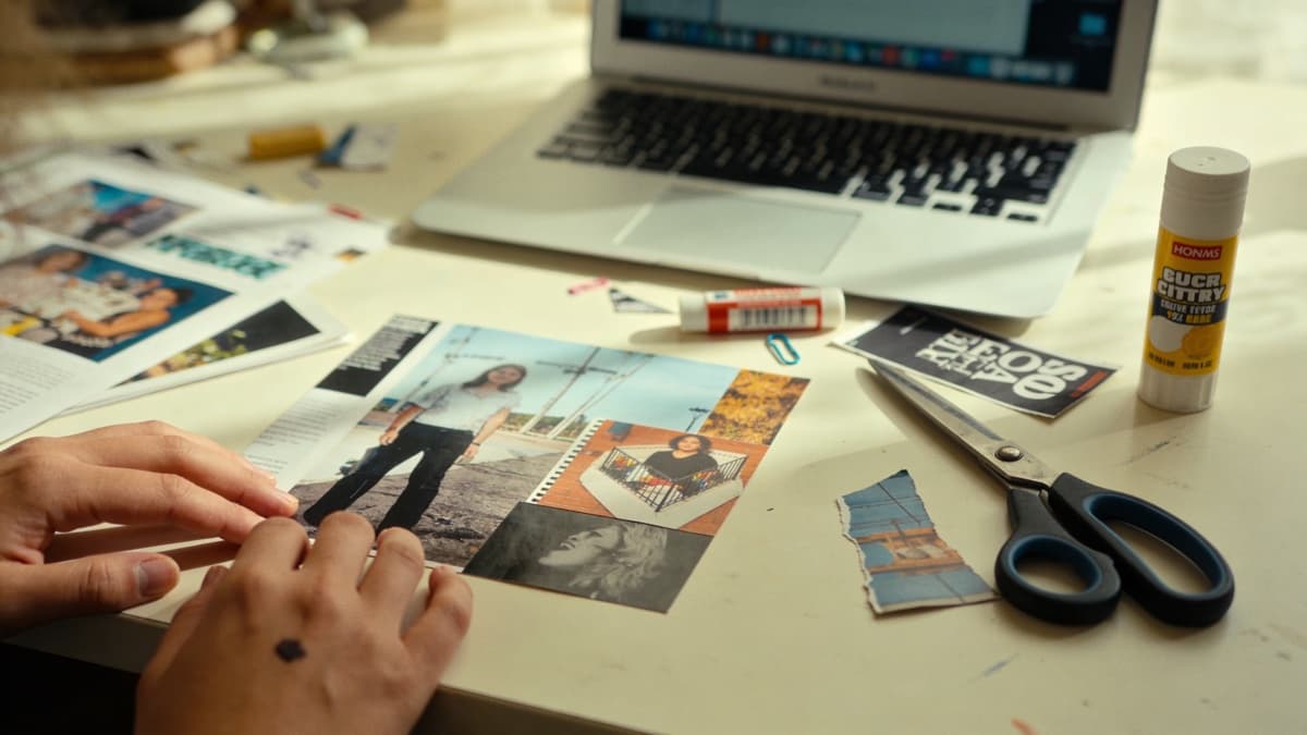
DIY and Handmade Elements
The DIY ethos central to indie music extends to visual presentation. Hand-drawn elements, collage, mixed media, and visible craft signal that a human made this rather than a production company. These elements create warmth and personality that polished design can't replicate.
Collage techniques—combining photographs, textures, found images, and hand-drawn elements—are particularly prevalent. The visible seams and imperfect edges of collage work communicate authenticity. Digital tools can create collage effects, but physical cut-and-paste often yields more convincing results.
Illustration, whether elaborate or rough, appears throughout indie artwork. Sketchy, unfinished drawing styles fit the aesthetic better than polished illustration. Doodles, marginalia, and casual marks add personality. These don't require formal art training—some of the most effective work comes from untrained hands with distinctive vision.
Consider incorporating actual physical elements into your process. Photograph hand-drawn pieces. Scan objects. Print images and physically alter them, then re-digitize. This analog loop adds authentic texture and imperfection that digital-only processes struggle to replicate.
Avoiding Aesthetic Clichés
Every aesthetic can become formulaic, and indie is no exception. The conventions that once signaled authenticity can become empty signifiers—grain filters that look like grain filters, vintage effects that read as costume rather than conviction. Understanding the clichés helps you avoid them.
The most obvious trap is over-processing. When every element screams "vintage" simultaneously, the effect becomes parody. Heavy grain plus extreme color grading plus obvious light leaks plus faded blacks equals a cover that looks like a preset rather than a vision. Restraint is essential; one or two subtle treatments beat five obvious ones.
Another cliché: literal interpretations of the music. If your album is called "Bedroom" with a song about staying inside, putting a literal bedroom on the cover is too easy. The best indie artwork operates through feeling and association rather than illustration. It creates mood parallel to the music rather than describing it.
Finally, beware of aesthetic borrowing without understanding. The visual language of indie evolved for reasons connected to the music's values—authenticity, intimacy, rejection of commercial polish. Applying these elements to music that doesn't share those values creates disconnection. Your visuals should emerge from your actual artistic sensibility, not from observation of what indie covers "look like."
Creating Indie Covers
The most effective approach to indie artwork isn't applying aesthetic formulas—it's developing genuine visual sensibility that emerges from the same values as your music. What do you actually find beautiful? What images capture how your music feels? Start from authentic responses rather than from "what indie covers should look like."
If photography is your medium, shoot constantly and develop editing approaches that become recognizably yours. Your iPhone and a free editing app are sufficient to start. The consistency of your vision matters more than your equipment.
If hand-drawn or mixed-media work appeals to you, experiment until you find approaches that feel right. You don't need technical skill—you need distinctive vision and willingness to explore. Some of the most memorable indie artwork comes from artists with no formal visual training.
For technical specifications, see our complete album cover size guide. For detailed guidance on creating artwork without professional tools, check our DIY guide. If you want AI assistance that understands indie aesthetics, ReleasKit can generate concepts aligned with the visual language described here.
The goal isn't to look indie—it's to authentically express your artistic vision through visual means.
FAQ