The Aesthetic of Retro-Futurism
Synthwave is as much visual genre as sonic one. The music recreates 80s synthesizer soundscapes; the artwork recreates 80s visions of the future that never arrived. Chrome sports cars, neon-lit cities, laser grids extending to infinity, sunsets in impossible colors. It's nostalgia for a future imagined decades ago.
The aesthetic emerged from movie posters, VHS covers, arcade cabinets, and 80s commercial design. Kavinsky's Outrun, Perturbator's Dangerous Days, Carpenter Brut's trilogy—these artists established visual conventions that now define the genre. To make synthwave is to participate in this visual conversation.
Synthwave artwork isn't 80s recreation—it's the 80s' imagination of what the future would look like, rendered with contemporary tools.
New Retro Wave — the genre's visual and sonic identity
Core Visual Elements
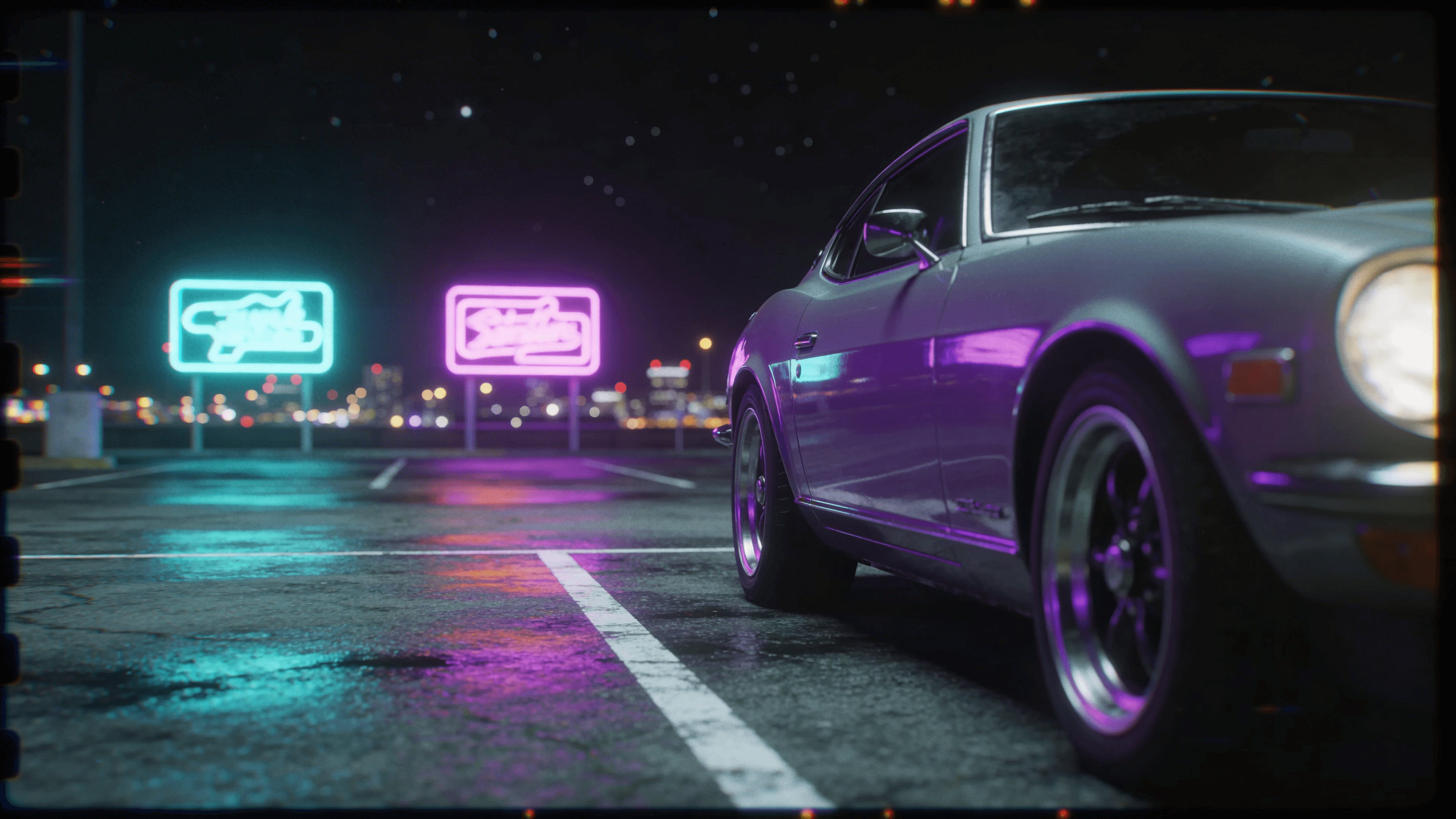
The grid: Perspective grids extending to the horizon are synthwave's signature element. They reference 80s computer graphics, early 3D rendering, and Tron aesthetics. Grids typically appear in bright colors—magenta, cyan, purple—against dark backgrounds.
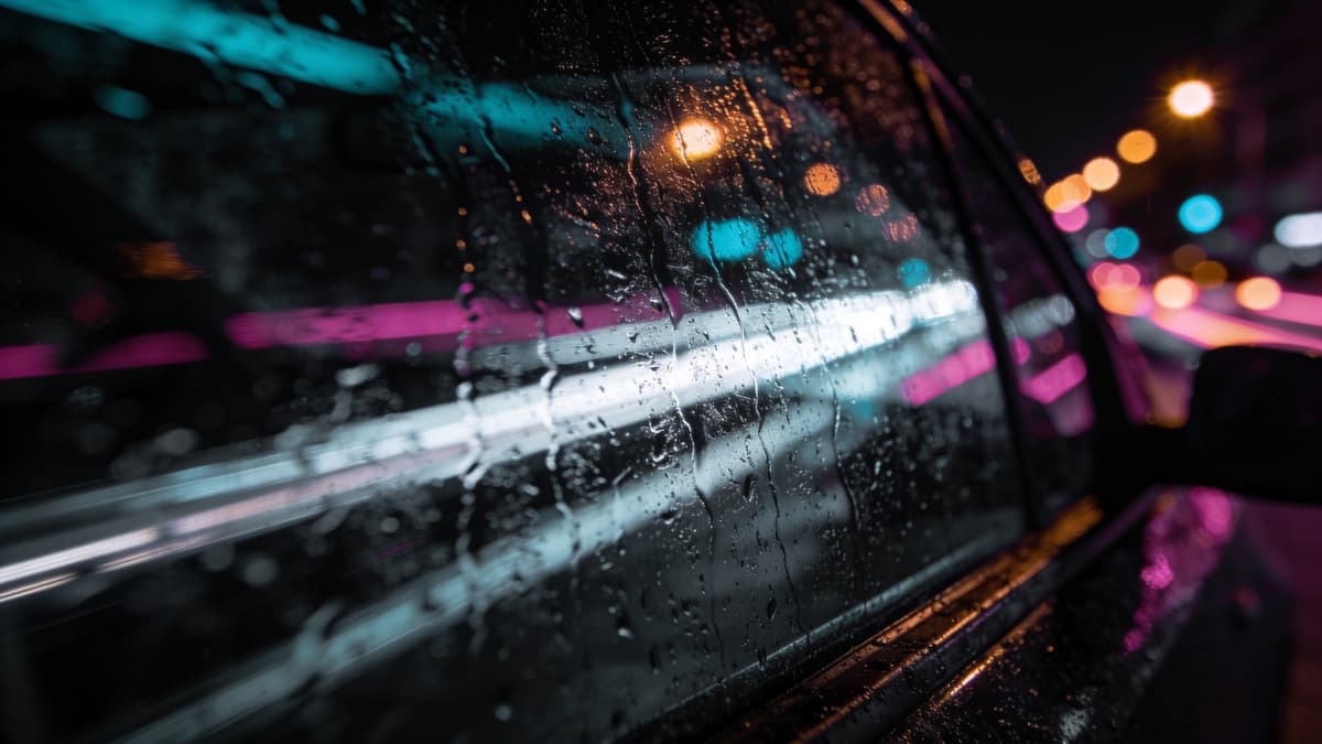
The sunset: Gradient sunsets in pink, orange, and purple dominate synthwave imagery. Often featuring horizontal line breaks that suggest VHS tracking errors or CRT scanlines. The sun itself might be striped or geometric.
Chrome and reflections: Metallic surfaces—sports cars, text, geometric shapes—reference 80s fascination with chromatic effects. Reflections, gradients, and chrome-like rendering connect to that era's commercial design.
Typography: Chrome text, neon glow, grid-line fonts. Typography often receives as much treatment as imagery—metallic gradients, outline effects, light bloom. The text is part of the image, not addition to it.
Kavinsky's OutRun — the album that defined synthwave's visual language
Neon Color Theory
Synthwave color palettes are highly specific. Not any 80s colors—particular combinations that reference particular sources.
Primary palette: Magenta/hot pink, cyan/electric blue, purple. These colors dominated 80s nightclub aesthetics and early computer graphics. They appear both as solid colors and as neon glow effects against dark backgrounds.
Sunset palette: Orange, pink, purple gradients. These reference Miami Vice aesthetics, 80s sunset photography, and early digital gradient experiments.
Dark foundation: Deep purples, blacks, dark blues serve as background for neon elements. The contrast between bright neon and dark background defines the aesthetic.
When working with these colors, consider how they interact with glow and blur effects. Neon doesn't just exist as solid color—it blooms, bleeds, reflects. The lighting behavior is as important as the color choice.
Techniques and Tools
Creating synthwave artwork requires understanding both 80s reference points and contemporary tools for executing that aesthetic.
3D rendering: Many synthwave covers use 3D software—Blender, Cinema 4D—to create grids, chrome objects, and geometric scenes. The low-poly aesthetic references early 3D while contemporary rendering enables cleaner execution.
Glow and blur: Neon effects come from layered glow treatments—outer glow, inner glow, blur combinations that create that characteristic bloom. Learn your software's blur and glow capabilities deeply.
VHS effects: Scanlines, tracking errors, color distortion reference analog video. These can be achieved through filters or manual distortion. Don't overdo it—subtle analog texture beats heavy-handed effects.
Photographic elements: Some synthwave incorporates photography—often of cars, cityscapes, or figures—heavily processed with synthwave color grading and effects. The photograph becomes material for synthwave treatment.
Perturbator's Dangerous Days — dark synthwave visual mastery
Beyond Cliché
Synthwave's visual language is now so established that cliché lurks constantly. Generic grids and sunsets no longer stand out. How do you participate in the aesthetic while adding something distinctive?
Specificity helps. Not just "a car" but a particular car model, rendered with attention. Not just "a city" but architecture with personality. Details create interest within familiar frameworks.
Personal elements: What can you add that's specifically yours? Imagery that connects to your music's particular themes or your personal aesthetic. The synthwave elements become vehicle for personal expression rather than entire statement.
Evolution within genre: Some artists push synthwave visuals in new directions—incorporating different color palettes, mixing with other aesthetic traditions, finding fresh angles on familiar elements. The genre continues evolving; contribute to that evolution.
Creating Synthwave Covers
Start with references. Collect imagery that captures the specific synthwave aesthetic you're pursuing. Are you more Kavinsky chrome or Perturbator dark? Miami Vice sunset or Tron grid? Know your specific position.
Learn the tools. 3D software takes time but pays dividends for synthwave—the genre practically requires geometric rendering capabilities. Free options like Blender are accessible; tutorials abound.
Typography deserves as much attention as imagery. Chrome text with proper reflection and glow is difficult to execute well. Practice or find artists who specialize in this treatment.
For AI-assisted creation, ReleasKit understands synthwave conventions well—neon, grids, retro-futuristic imagery. Describe specific elements you want, and explore what emerges.
Great synthwave artwork doesn't just look 80s—it looks like the 80s' dream of 2020, rendered by someone who understands both eras.
FAQ