Visualizing the Unvisualizable
Ambient and experimental music exists at the edges of conventional sound. Drones that evolve over twenty minutes. Textures that hover between music and noise. Compositions that reject verse-chorus structure entirely. How do you create visual art for music that defies standard categorization?
The answer lies in embracing the same principles that guide the music itself: patience, texture, atmosphere over statement, and willingness to let things breathe. Experimental album art shouldn't explain the music—it should create a parallel space where similar ideas operate visually.
The best ambient artwork doesn't illustrate sound—it creates visual silence that resonates with sonic silence.
Ambient Relaxation — atmospheric electronic that embodies the genre's visual minimalism
The Power of Almost Nothing
Ambient music often works through reduction—stripping away until only essential tones remain. Visual equivalents embrace similar emptiness. A single horizontal line. A gradient so subtle you're not sure it's there. Vast negative space with one small element barely visible.
This minimalism requires tremendous precision. When your cover contains almost nothing, every element carries enormous weight. The exact shade of that gray. The precise position of that line. The particular quality of that blur. These decisions define the entire work.
Labels like Kranky, Room40, and 12k have established visual languages around this minimalism—austere, precise, quietly beautiful. Study their catalog artwork to understand how restraint creates presence.
Practically, minimalist covers are difficult to execute well. They benefit from high-resolution output and careful attention to how they'll display at thumbnail size. A subtle gradient might disappear entirely when small. Test your artwork at the sizes it'll actually appear.
Brian Eno's Ambient 1: Music for Airports — the genre-defining album with artwork as restrained as its sound
Texture as Subject
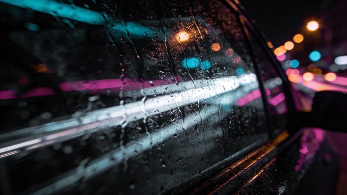
Where some experimental artwork empties out, other approaches fill in—but with texture rather than objects. Close-up photographs of surfaces become abstract fields. Paper grain, rust patterns, water stains, fabric weave. The subject is the texture itself.
This approach works particularly well for music built from processed field recordings, tape manipulation, or textural synthesis. The visual texture creates synesthetic connection to sonic texture. Rough sounds pair with rough surfaces; smooth drones pair with soft gradients.
Film photography and analog processes produce organic textures that digital perfection lacks. Even if working digitally, consider adding film grain, scanner artifacts, or print textures. The imperfections of physical media carry warmth that pure digital imagery often misses.
Macro photography opens rich territory—extreme close-ups transform ordinary materials into abstract landscapes. Water, metal, stone, biological matter all become unrecognizable when magnified sufficiently, creating imagery that exists somewhere between documentation and abstraction.
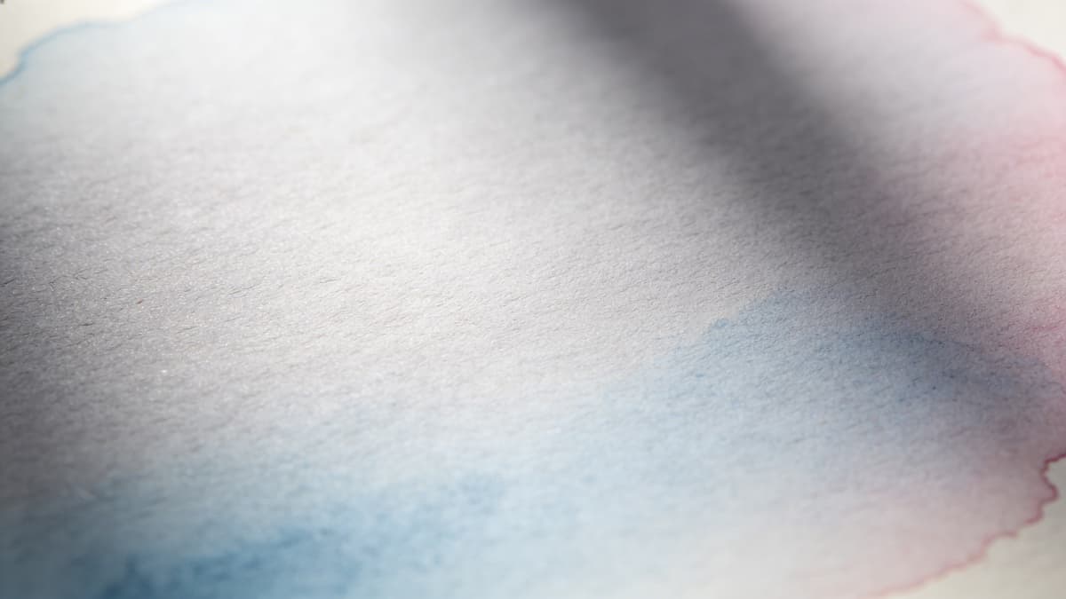
Pure Abstraction
Music without melody or rhythm finds natural visual partner in imagery without representation. Pure color fields. Geometric forms floating in undefined space. Gradients bleeding into gradients. Nothing to recognize, only qualities to experience.
Abstract artwork for experimental music differs from abstract artwork for commercial electronic—it typically moves slower visually. Where EDM abstraction might be dynamic and aggressive, ambient abstraction often feels still, contemplative, meditative. The visual energy should match the sonic energy.
Color becomes crucial in purely abstract work. Limited palettes—two or three colors at most—often work better than complexity. The relationships between colors create the entire emotional content. Cool tones recede; warm tones advance. High contrast energizes; low contrast calms.
AI generation handles pure abstraction well. Describe the mood, the color relationships, the sense of space, and let the model produce non-representational imagery. This often produces results that feel genuinely appropriate to experimental music rather than commercially polished.
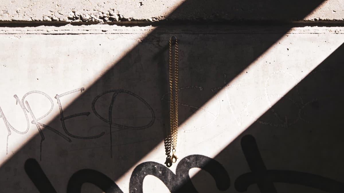
Found and Processed Imagery
Experimental music often incorporates found sounds—field recordings, samples, discovered audio. Visual equivalents work similarly: found photographs, scanned ephemera, repurposed imagery processed into new contexts.
Vintage scientific imagery has particular resonance with experimental music. Astronomical photographs, microscopy, geological surveys, botanical illustrations—imagery created for documentation rather than aesthetics carries a different quality than commercial photography.
Heavy processing transforms found imagery into something new. Extreme color shifts, multiple generations of copying, digital corruption, collage and recombination. The source material becomes raw material rather than finished product.
This approach connects to experimental music's often archival quality—its interest in sounds from specific times and places, processed through contemporary tools into new forms. Found imagery processed through contemporary techniques creates parallel archaeological sensibility.
Typography for the Experimental
Text treatment in experimental music artwork often breaks conventions. Extremely small type, barely readable. Unusual placements—vertical, along edges, partially obscured. Non-standard characters, symbols, or invented notation.
Some releases minimize text entirely—no artist name, no title, just a catalog number or nothing at all. This works when distributed through channels where listeners already know what they're getting, but can be impractical for wider distribution where discoverability matters.
When text appears, it often functions as visual element rather than pure information. The letterforms become shapes; the arrangement becomes composition. Consider how type interacts with imagery rather than simply sitting on top of it.
Monospaced and technical typefaces appear frequently—connecting to experimental music's often process-oriented nature. The aesthetic of research, of systems, of notation. Hand-drawn or degraded type creates opposite associations—the personal, the decayed, the human despite the abstraction.
Creating Experimental Artwork
Experimental music permits—even encourages—experimental process. Don't feel bound by conventional artwork workflows. Generate, manipulate, degrade, recombine. Print and rescan. Photograph your screen. Let accidents happen.
If using ReleasKit, try descriptions focused on atmosphere and texture rather than objects: "Vast empty space, barely perceptible gradient from dark gray to slightly less dark gray, the visual equivalent of a tone that sustains for ten minutes." See what emerges; refine from there.
Consider whether your artwork should be still or suggest movement. Ambient music often creates sense of slow evolution—perhaps your artwork should feel similarly caught mid-transformation, unstable, becoming rather than fixed.
Technical specifications still matter—experimental artwork still needs correct dimensions and formats for streaming platforms. See our platform requirements guide. But within those constraints, everything else is open.
Experimental artwork should feel like it was made by someone who listens to experimental music—because it should be.
FAQ