Sensory Overload as Aesthetic
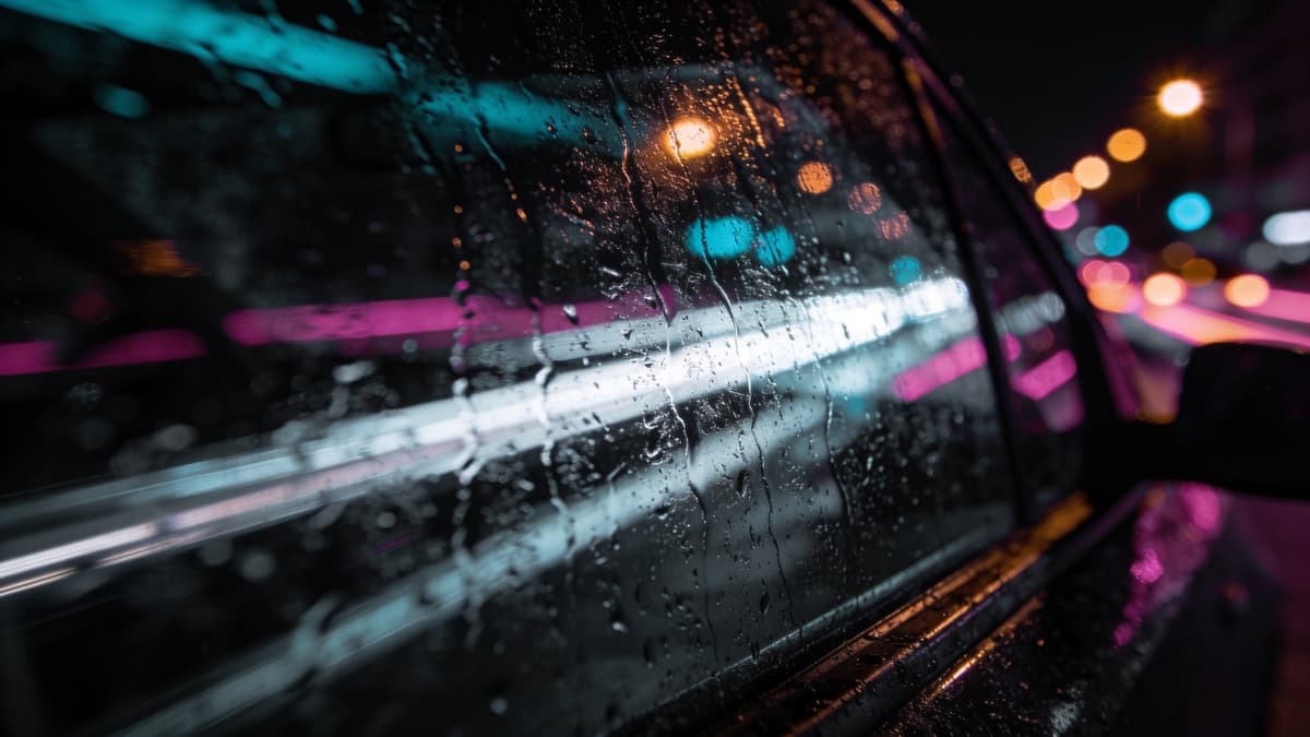
Hyperpop rejects subtlety. The music layers distorted vocals, extreme pitch shifts, and digital maximalism until the mix threatens to collapse. The visual aesthetic follows: sensory overload, digital chaos, imagery that's almost too much to process.
100 gecs, SOPHIE, A. G. Cook, and the broader PC Music collective established visual conventions that prioritize internet-native surrealism over traditional design principles. The resulting imagery looks like internet culture processed through fever dream.
Hyperpop visuals should feel like being online for too long—overwhelming, surreal, vaguely threatening, kind of beautiful.
hyperpop — digital maximalism defined
Digital Maximalism
Where most genres value restraint, hyperpop values excess. More is more. Layer digital artifacts, clash colors, pile imagery until the composition threatens to become noise.
This maximalism isn't random—it's intentional chaos. The best hyperpop artwork has underlying structure beneath the surface overload. The trick is creating controlled overwhelm rather than actual mess.
Common elements: glitch effects, multiple transparency layers, saturated and clashing colors, compressed and pixelated imagery, text in multiple fonts and sizes. Each element competes for attention; the competition is the point.
Execution requires confidence. Half-hearted maximalism looks like mistakes. Fully committed maximalism looks like artistic statement. If going this direction, commit completely.
100 gecs' 1000 gecs — maximalist chaos that launched the hyperpop visual era
Internet-Native Aesthetics
Hyperpop emerged from internet culture, and its visual language reflects that origin. The imagery references online existence: memes, digital artifacts, social media aesthetics, the particular surrealism of being online.
This isn't nostalgia for early internet—it's native fluency in contemporary digital visual culture. The references are current, the sensibility is "extremely online," the target audience immediately recognizes the visual vocabulary.
Common references: low-res imagery, emoji and text integration, surveillance aesthetic, corporate design twisted into absurdity, the uncanny valley between digital and physical. The imagery should feel like it could only exist online.
SOPHIE's OIL OF EVERY PEARL'S UN-INSIDES — hyperreality defining hyperpop aesthetics
Creating Hyperpop Covers
Embrace excess. Whatever your initial composition, add more. More layers, more effects, more clashing elements. Then step back—is it overwhelming enough? If you can process it easily, it might not be hyperpop.
Technical skills matter differently here. Traditional composition rules exist to be violated. But you need to understand what you're violating—unintentional mess differs from intentional chaos.
Consider internet-native distribution. Hyperpop artwork lives on screens; optimize for digital display. Bright colors that pop on phones, imagery that works as social media assets, compositions that communicate even when compressed.
ReleasKit can generate hyperpop-adjacent concepts—digital surrealism, maximalist compositions, internet aesthetics. Describe the overwhelming feeling you want and explore what emerges.
Great hyperpop artwork should be almost uncomfortable to look at—then you can't look away.
FAQ